Game Jam UX/UI Design
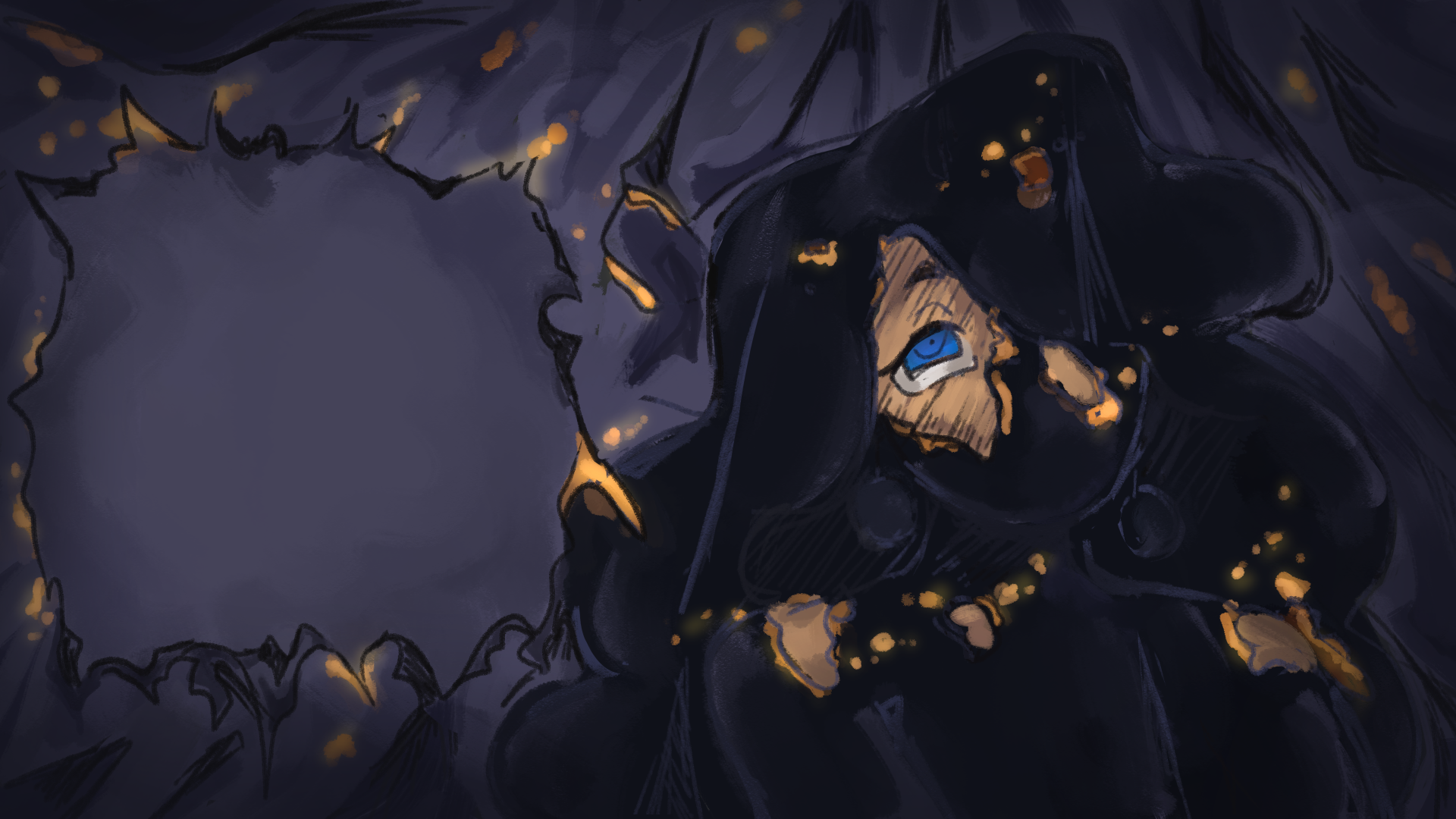
Your Eyes Aren’t Blue is a psychological horror Visual Novel game that follows a young woman, Tiana, as she grieves the sudden death of her best friend, Viola.
As part of a 30-day game jam contest, this project delivered a striking and intuitive UX/UI design for a horror-themed visual novel game.
-
Responsibilities:
- UX design
- Wireframing
- Prototyping -
Challenges:
- Short development cycle
- Small team with limited resources
- Commincation (long wait times) -
Tools & Software:
- Figma
- Miro
- Adobe Photoshop -
Duration:
- 1 month
Design Process
>
>
Design ProcesS
WIREFRAMING
The UX/UI team met with the development and game design teams to determine the game's UX/UI design requirements.
The identified requirements were broken out into “cards” that kept track of notes for specific interactions, functions, and behaviors.
Using the requirement cards, wireframing began on the menus, options, and screens with basic elements and placeholder graphics.
Wireframes were tested internally with other team members (sound designers, graphic artists, etc).
The team revised some of the designs based on feedback, and a second test of the wireframes was performed.
The wireframes were finalized and readied to be reskinned by the UI artist.
Prototyping
Prototyping
Wireframes were tested internally with other team members (sound designers, graphic artists, etc).
The team revised some of the designs based on feedback, and a second test of the wireframes was performed.
The wireframes were finalized and readied to be reskinned by the UI artist.
Collaboration with the graphics team helped develop a basic style sheet for the game. This included font, colors, and overall feel.
Design inspiration was from the artists' existing color palettes, Character Graphics (CGs), and backgrounds. Blue was the obvious choice for primary highlight color.
FINAL UI DESIGN
Save/Load: Before
Save/Load: After
Options: Before
Options: After
Pause: Before
Pause: After
History: Before
Hstory: After
FINAL UI DESIGN
Collaboration with the graphics team helped develop a basic style sheet for the game. This included font, colors, and overall feel.
Design inspiration was from the artists' existing color palettes, CGs, and backgrounds. Blue was the obvious choice for primary highlight color.
Final thoughts & reflections
The project was gratifying; I used what I learned from smaller projects to help create a UX that felt intuitive and natural.
I would have liked to have done more game experience testing (beyond the UX/UI) to see how players felt about the game.
Looking Back
Communication with developers and graphics teams is essential in producing a good design.
Testing designs internally under time constraints is okay if the participants are diverse.
Do research and look to other good designs for inspiration. We took a lot of UI/UX design queues from Nintendo games (Breath of the Wild).
The best designs sometimes get the least amount of feedback.


